
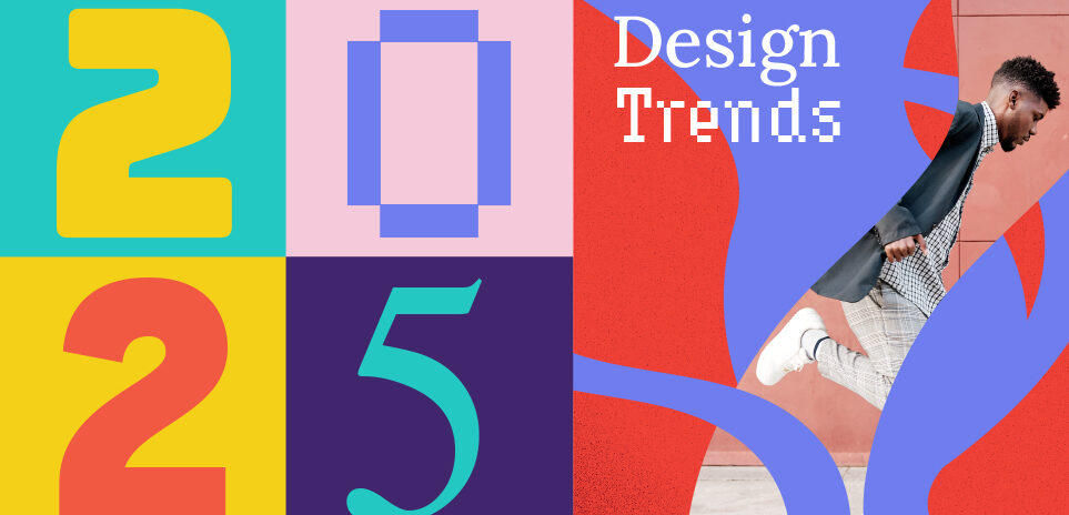
New year new graphics!
What’s in store from a design perspective for 2025? We took a deep dive into the digital landscape, looking at design influencers and technology forerunners like Adobe to find out what’s on the design trend horizon for 2025.
1. Minimalism with a boost!
Minimalism has always been a popular design choice, with clean, white space, carefully considered typography and graphic placement. This year minimalism is being enhanced with an emphasis being placed on key design elements, while others take a back seat.
PayPal’s recent brand update illustrates this perfectly, it’s still clean but very bold and confident. One stand-out element per design application is key, everything else is stripped back by necessity. This style is often used with bold colour combinations.
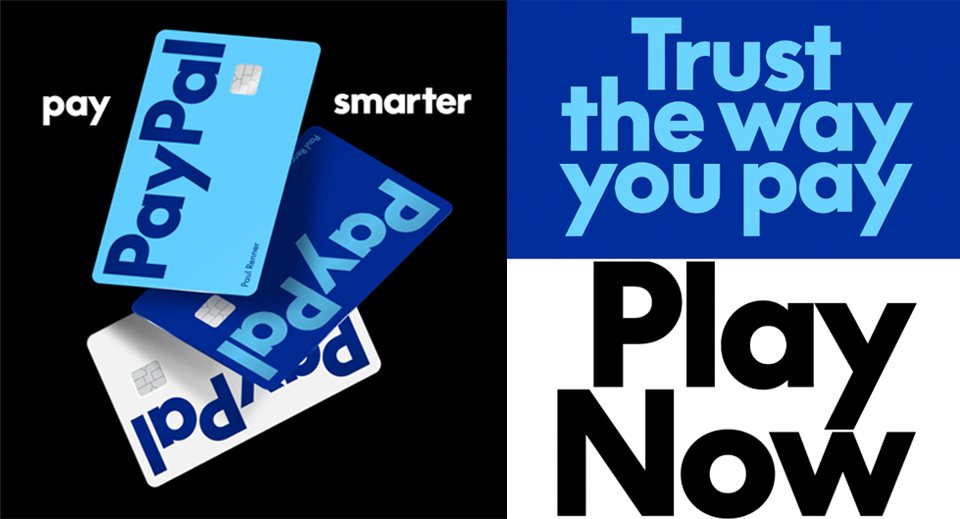
Credit: Pentagram, PayPal
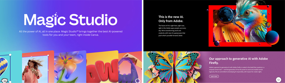
2. AI Generative Design
There is no escaping the reality that lots of designers are integrating AI generated content into their creatives.
Moving forward, the challenge will be to harness the benefits of AI to improve and enhance the process without taking over and governing important design decisions.
There is no compensation for human creativity. However, the collaborative possibilities are endless, and the new AI tools on offer are revolutionising the ways we can work, making more time for creativity and brand strategy.
This is extremely exciting, it means designers will be able to streamline processes giving back valuable time for creativity and blue sky thinking.
3. Unconventional colour combos
Unconventional colour choices and bold combinations are a current trend of the moment, shocking to look at they create impact and intrigue. The more unconventional, the better to create a memorable design that looks youthful and energetic, which is both brave and bold. It won’t work for all brands but if you’re after a modern, fun and engaging creative, then go crazy. The key to this trend is to choose colours that don’t visually marry up, supported by a single colour that holds the design together.
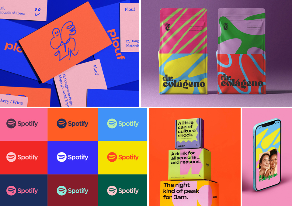
Credits: Dr. Colágeno, Behance, Multiple Owners, Plouf, Studio IeM, Spotify, Peak Social Tonics
4. Custom shape cropped images
Images placed into a custom shape is a design trend of the moment that I really like, however it can be quite challenging to execute.
The shape is often taken from a logo devise or brand element, with great effect when translating a brand image onto layouts. Working in a more abstract way, images can be resized to completely fill the shape, or with part of the image breaking out of the shape intentionally to bring a composition to life.
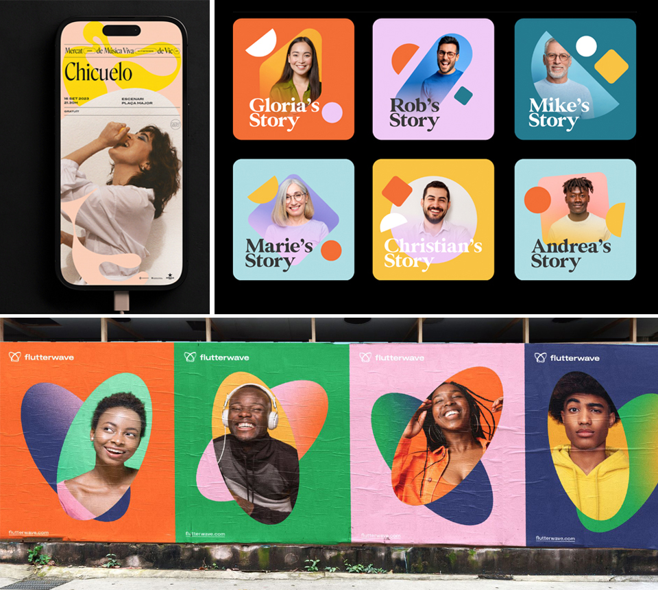
Credits: Quim Marin, Illo Studio, Verve, Flutterwave
We used this technique recently in a branding product for Chartered Accountants South East, utilising logo elements to house images with a striking impactful result.

Credit: YMT
5. Pixels
Pixel typography and pixel design has felt outdated in recent years, perhaps tarnished by a legacy of bad quality, overused, complicated designs heavy with detail.
However, it has been popping up more often recently, in a fresh minimalist way, that is playful and versatile giving a techy feel to designs.
This example from ‘Share it’ uses pixels blended with a bold colour palette to give personality and a modern technological spin to their brand identity.
Credit: Share IT, Multiple Owners, Behance
FMEC Group use it to convey they provide software solutions for the agricultural industry, adopting a minimal and well considered approach to keep the message simple. Both examples use the graphic design trend of custom shape images discussed above, using the pixel as part of the shape.
Credit: FMEC
6. Grainy Textures
Textured ‘noise’ overlaying elements, in a considered and obvious way gives an urban feel and dimension to a flat design. We are seeing a lot of AI design at the moment which is perfect and precise, but often missing ‘something’ you can’t quite put your finger on.
Adding a grainy edge gives it that personal, human feel, that is a little less flawless and a little more real. Be subtle with this design trend though, to give depth and motion. Adobe have used it recently and it’s a key trend with illustrators.
Credit: Adobe
With more technology at our fingertips 2025 is a very exciting time in the world of design. We can break boundaries, experiment and be creative in new and interesting ways to develop purposeful, effective design.
It’s always fun to adopt the latest technology and trends, underpinned by a subconscious eye on whether or not they suit a particular purpose, brand message and target audience. Used sympathetically you can refresh and update a brand but use with caution!