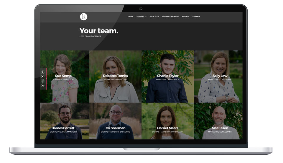
This month we have launched a new look website and evolved the brand – moving from Your Marketing Team to K. I must admit, this wasn’t quite in the plan. It was a team effort. When James approached me and said ‘Sue, we need to change the website’, my first reaction was that we have client work to focus on and it’s not a priority. But on reflection, I completely understand why we needed to do it and why now was the perfect time.
Changing the way we work
When I started the business nearly five years ago, I set it up to provide individual freelance marketing management services. I was on my own. I had the first customer, before I had the business, so after researching some weird and wonderful names, then finding the domains were already taken, I plumped for plain old ‘Your Marketing Team’ just to get set up. The original logo was developed just over two years ago, when I decided to put a website together. Beccy came to join me, originally to help with a social media training course, to raise money for Sense UK. At the same time, the number of enquiries and referrals grew, so she stayed. As the business grew, Sally joined us as an additional marketing consultant, then Harriet came on board to fill a digital marketing consultancy skills gap. Over the past year, we brought in Mat to co-ordinate a social enterprise project then built up a digital operations team to include Charlie, James and Oli.
Most growing businesses need to evolve. The market changes so the services often need to adapt to fill the need. For us, we went from providing an individual marketing management service to providing small business owners with a completely outsourced team. Not just one brain but eight individuals, with all the skills needed to become a virtual marketing department. We had expanded our offering and changed the direction of the business.

From Kemp to K
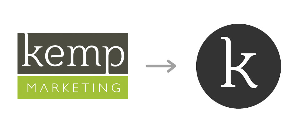
The original Your Marketing Team logo was boxed into a rectangle. When it was first developed, we separated the K as a potential icon for social media. Over the years, we started using it on it’s own for Instagram and various places where the full logo didn’t fit in a circle. We all realised we quite liked it. It grew on us. Particularly when colour matching the lime green on the original for print proved a little tricky at times. By dropping the lime green, James was able to introduce more colours on the website and it simply looked cleaner.

Transforming the look of the website
The new website was a project led by our Digital Projects Manager James, with support from Oli and Charlie. An operations team effort, with very little involvement from me. The only remit was to keep the original theme of ‘growing’ using trees, plants and flowers imagery and to keep it simple. Oli rewrote the copy to reflect our new team service and Charlie dug out some rather wild images. We reviewed it during our Tuesday team meeting and all instantly loved the design – and the unusual introduction of animals!
The new website has given us an updated look. We frequently tell our customers that having an old fashioned or dated website does not reflect well on their business. A website is essentially a shop window for a small business. Particularly now when you walk down the high street and people are walking past real shop windows staring at their mobile phone screens! It is the place where many businesses make a first impression.
The techy bit
Updating the look wasn’t the only reason James was keen to update our site. When I created the previous site, I didn’t have any in-house expertise, so I chose a WordPress template for the job. Modified WordPress templates can often look the part, but under the surface they have their restrictions compared to bespoke sites built from scratch. Our previous site had coding errors and did not meet web validation standards. W3C or The World Wide Web Consortium is the main international standards organization for the World Wide Web. Although it is not essential that all websites are 100% free of validation errors. As larger sites like Sky, Nike and even Google are not 100% clean of coding errors, ideally the aim should be to reduce them to as minimal as possible. In addition, the site needed to be updated as structurally it wasn’t performing well for SEO. With the new bespoke site, we now have more control on what is indexed by search engines.
Rolling out across the business
Creating a new identity and website is the fun bit, the tricky part is managing and co-ordinating the rollout. Ideally, every piece of collateral, document or webpage that features the old brand should be updated at the same time to ensure brand consistency across the board. We also recommend starting with a ‘soft launch’ for the website, to iron out any potential testing issues before announcing to customers or prospects.
If you are thinking of evolving your brand or looking at updating your website, we would love to help. Let’s talk…

